In September 2026, the Yarra Ranges Council east of Melbourne approved a revised landslide hazard map. The revision brought 1,869 properties into its Erosion Management Overlay for the first time, which means their owners now need geotechnical advice before earthworks, tree clearing, or foundation work. That part of the story is what you would expect from a new hazard map. The surprising part is the other number: 1,702 properties were removed from the overlay, and the area considered susceptible to landslides shrank from 137 to 117 square kilometers. Better data did not only find more danger. It also showed where the old map had drawn danger that was not there.
The data behind the change was airborne LiDAR. Older hazard mapping often relied on coarse elevation grids that smooth out steep, small-scale terrain. The new mapping is tied to the shape of the ground itself, including historical rupture scarps, unstable drainage gullies, and colluvial deposits that standard photogrammetry cannot see. In this article we look at how a LiDAR point cloud becomes a terrain model that a geologist can read, which visualizations make landslide features visible, where those terrain models can mislead, and what to ask before one of them becomes a planning rule.
From Point Cloud to Bare-Earth Terrain Model
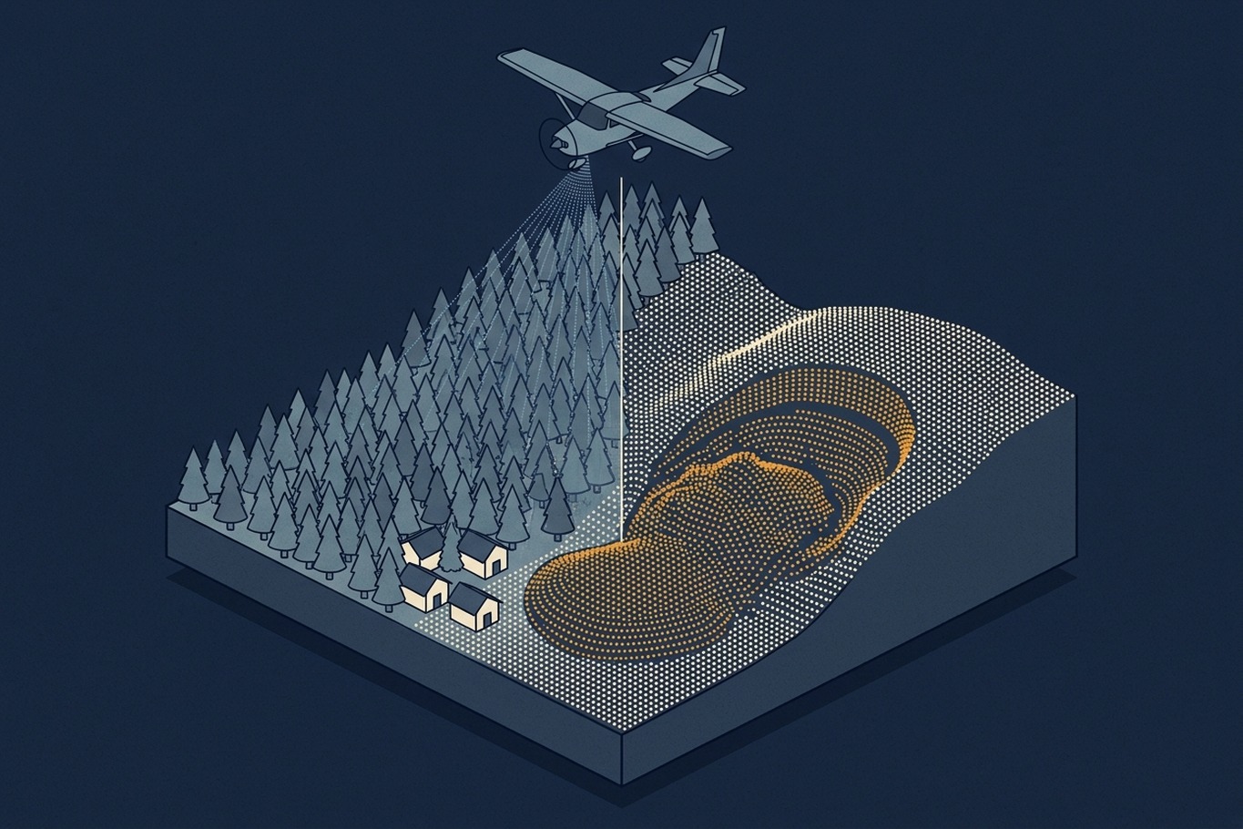
A digital terrain model (DTM) is a grid of ground elevations with everything above the ground removed: trees, buildings, cars, and power lines. It is built from the points in a LiDAR survey that were classified as ground. A ground filter separates those points from the rest, and an interpolation step fills the grid between them.
The reason LiDAR works under forest is simple. A laser pulse has a small footprint, and some of its energy passes through gaps in the canopy, reaches the ground, and returns as a last echo. Aerial photography only sees the top of the canopy, so a photogrammetric surface model of a forest describes the trees, not the slope beneath them. This is why a landslide scar that is completely invisible in an orthophoto can be obvious in a LiDAR terrain model of the same area.
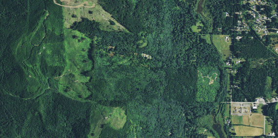

The limitation is that only a fraction of the pulses reach the ground, and that fraction varies. Under dense evergreen forest, the ground point density can be a small part of the total point density on the specification sheet. Where ground points are sparse, the interpolation fills larger gaps with smooth surfaces, and a small scarp or a narrow gully can simply disappear. For hazard mapping, the number that matters is not how many points were collected overall, but how many of them landed on the ground in the steepest and most densely vegetated parts of the project.
A terrain model is still only a grid of numbers. To find landslides in it, someone has to look at it, and how it is displayed decides what they will see.
Reading the Terrain: Hillshade, Slope, and Local Relief
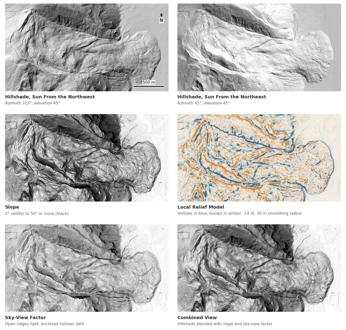
The most familiar view is the hillshade, which lights the terrain from a virtual sun and shades each cell according to how much it faces that light. It is intuitive because it looks like a photograph of a landscape. The standard setting places the sun in the northwest (an azimuth of 315 degrees) at 45 degrees above the horizon.
Hillshades have two well-known weaknesses. Details inside deep shadows are hard to see, and linear features that run parallel to the light direction receive the same shading on both sides, which makes them nearly invisible. A scarp running northwest to southeast can vanish under the standard light. The protocol from the Oregon Department of Geology and Mineral Industries (DOGAMI) notes that earlier landslide mapping by the USGS in Seattle had to view hillshades with at least three different sun directions for this reason, and it layers a slope map and color-coded elevation under the hillshade to make the terrain easier to read.
Several visualizations avoid the light direction problem altogether. A slope map colors each cell by its steepness, so the steep break of a head scarp stands out regardless of which way it faces. A local relief model subtracts a smoothed version of the terrain from the original, leaving only the small bumps and hollows, which exaggerates subtle features that would otherwise be lost in the overall shape of a valley. The sky-view factor measures how much of the sky is visible from each point, which is similar to lighting the terrain from all directions at once. Many of these methods came from archaeology, where the goal is also to find faint shapes in the ground under vegetation. The Relief Visualization Toolbox from the Research Centre of the Slovenian Academy of Sciences and Arts (ZRC SAZU) bundles most of them and is available as a free QGIS plugin.
In practice, interpreters combine several views rather than relying on one. Each visualization emphasizes something different, and a feature that appears in more than one of them is more likely to be real.
Further reading
- Sky-View Factor as a Relief Visualization Technique | Zakšek, Oštir, and Kokalj, Remote Sensing
The paper that introduced sky-view factor as a visualization, with a clear explanation of why hillshades hide features parallel to the light. - Relief Visualization Toolbox | ZRC SAZU
A free toolbox that produces hillshades, slope, local relief models, sky-view factor, and blended views from any elevation model.
What a Landslide Looks Like in a Terrain Model
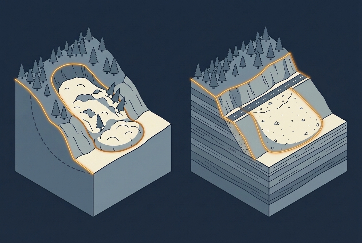
Once the terrain is visible, landslides have a recognizable shape. At the top is the head scarp, a steep, often curved break where the ground pulled away. Along the sides are the flanks, where the moving mass sheared past stable ground. Inside the slide, the surface is often hummocky, with internal scarps, small closed depressions, and ridges running across the slope. At the bottom is the toe, where the material bulged out and came to rest. Debris flows leave a different signature: a channel that opens into a fan at the base of the slope.
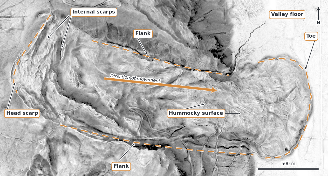
Not every landslide shows all of these features clearly, especially older ones that have been softened by erosion and vegetation. The DOGAMI protocol handles this by scoring each mapped landslide on how clearly its head scarp, flanks, toe, and internal scarps can be seen, and it turns that score into a confidence level of high, moderate, or low. It also admits a practical limit: landslides smaller than about 100 square meters may not be identified at all.
Even with those limits, the difference from older methods is large. In the DOGAMI pilot study, LiDAR data led to the identification of 3 to 200 times as many landslides as the other datasets available for the same area. In Washington State, where LiDAR collection for landslide mapping expanded after the 2014 Oso landslide, the Washington Geological Survey had mapped 34,683 landslides by early 2024 in six counties that cover only about 14 percent of the state. Most of those landslides are old, and that is the point. The best predictor of where the ground may move is where it has moved before.
Further reading
- Protocol for Inventory Mapping of Landslide Deposits from Lidar Imagery | William J. Burns and Ian P. Madin, DOGAMI
A widely used protocol that explains which terrain visualizations to use, which landslide features to look for, and how to score confidence. - Lidar | Washington Geological Survey
The statewide LiDAR program that followed the Oso landslide, with access to the data and the resulting landslide inventories.
Where the Terrain Model Can Mislead
A terrain model shows shape, not cause. A road cut has a steep face at the top and fill material below it, which can look much like a head scarp and a toe. Quarries, old terraces, embankments, and building platforms create similar patterns. The coverage of the Yarra Ranges revision points to exactly this challenge: high-resolution ground data can classify artificial features as natural slope hazards, and that becomes a real issue when property owners challenge the map in planning hearings.
Some errors come from processing rather than from the landscape. If low vegetation or a fallen tree is wrongly classified as ground, it appears as a bump in the terrain. If ground points are missing under dense cover, the interpolated surface can create smooth ramps that look natural but have nothing to do with the real ground. And if two overlapping flight lines were not properly aligned, the offset between them leaves a straight step in the terrain model that a shaded view will display just like a small scarp. A straight feature that follows the flight direction deserves a second look.
There is also a limit to what one terrain model can say about time. A single survey shows that the ground failed at some point, but not whether it is still moving. An old, stable landslide and an active one can look similar. This is why mapping protocols include a review of historical aerial photographs and field checks, and why field verification remains the expensive but necessary step between a desktop interpretation and a legally binding hazard map.
The same terrain models that support landslide mapping also serve other hazards, and there the demands on the data shift.
Beyond Landslides: Volcanoes and Coastlines
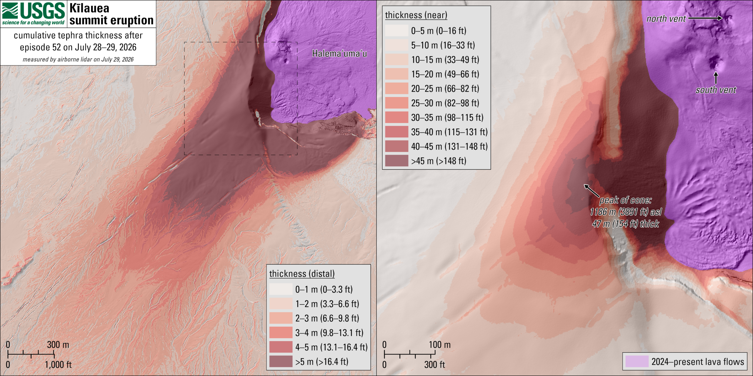
At Kīlauea in Hawaiʻi, the USGS Hawaiian Volcano Observatory flew a helicopter LiDAR survey in July 2026 over a tephra cone built up during the eruption that began in December 2024. Compared with the ground surface before the eruption, the cone had grown to 47 meters of cumulative thickness. The observatory had tried photogrammetry first, but the fresh deposit had almost no surface texture for image matching, and a persistent volcanic gas plume disturbed the images. LiDAR measures distance directly and does not need texture, so it delivered where photogrammetry could not, at the cost of a survey that is harder to collect and process.
The Kingdom of Tonga shows the coastal side of the same idea. As part of the Tonga Coastal Resilience Project, funded by the Green Climate Fund and implemented with UNDP, a survey flown between March and April 2026 over Tongatapu and the Haʻapai group completes the country’s first national LiDAR baseline. The main use is flood and coastal inundation modeling. On low-lying islands, the relevant question changes from “what shape is the ground” to “how high is it, exactly”. A few centimeters of vertical error decide whether a model floods a village or leaves it dry, so vertical accuracy and a clean ground classification along the shoreline matter more than the fine detail of slope shape.
Both examples depend on a comparison: the Kīlauea thickness is measured against an earlier surface, and Tonga’s baseline exists so that later surveys can be compared with it. A single terrain model is a snapshot. Its full value for hazard work often appears only when a second one is flown, a theme we explored with repeated flights over forests.
Further reading
- Kīlauea Tephra Cone Mapped with Lidar | Lidar News
How the USGS Hawaiian Volcano Observatory measured an active tephra cone after photogrammetry failed on the featureless deposit. - Tonga to Complete Full Lidar Mapping of Low-Lying Islands This Year | GIM International
Background on Tonga’s national LiDAR baseline and its planned use for coastal risk and sea-level rise modeling.
What to Ask Before a Terrain Model Becomes a Hazard Map
If you commission, review, or rely on a LiDAR-based hazard map, a few questions go a long way. How many ground points per square meter were achieved in the steepest and most densely vegetated areas, not just on average? Was the survey flown in leaf-off conditions where the forest allows it? Which visualizations were used for interpretation, and were hillshades viewed from more than one direction? How were artificial features such as road cuts and fill separated from natural ones? Were overlapping strips checked for offsets that could look like terrain features? And how much of the mapped area was verified in the field?
These questions matter because a hazard map does not stay a technical product for long. In the Yarra Ranges, it became a planning overlay that affects permit costs, property values, and insurance for thousands of households, in both directions. As more councils and national agencies replace coarse older maps with maps drawn from the shape of the ground, the quality of the terrain model moves from a detail in a data specification to something that property owners, planners, and insurers will argue about. And once the first terrain model exists, the next question follows quickly: not only where the ground has moved, but whether it is moving now.
Further reading
- Revised Erosion Management Amendment Approved Despite Objections | Mountain Views Mail
The local report on the council decision, with the final numbers of properties added to and removed from the overlay. - Yarra Ranges Overhauls Landslide Hazard Mapping | Lidar News
A technical view of the revision, including the risk that high-density ground returns classify artificial features as natural slope hazards.